Archive
The plot a month later
Over the past month I have worked solid on rewriting the plot facilities
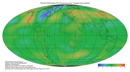
Figure 1, low resolution web image, comparable as shown at the beginning of May except a different geographic projection, done using wildly different software.
This is a quick look at what is new, the full thing is about to be used as part of a major article at the Talkshop.
Why? I was thoroughly fed up with fighting gnuplot, drives many people half crazy trying to get it to do what is wanted, all too often it simply can’t. In this case the final straw was no way of disabling automatic smearing of colour, nor can it draw literal filled polygons. (very amusingly given the authors say it can’t it then when writing out SVG format proceeds to write out filled polygons… can’t make it up stuff)
I was already using GLE, a tool with ancient origins. This will do what I say so all those polygons are drawn one at a time. The whole thing is very complicated, more so since my code writes GLE code and data before passing the whole lot over for plotting (GLE in turn calls ghostscript with postscript code, wheels within wheels)
There is more…
Images of the 1998 El Niño in world temperature maps
A reader asked for a time representation… a tricky problem via a web site, the data is large…
Here are three different views, two from the UK Met Office and one from UAH, the newly released version. These run from January 1996 through December 2000.
Firstly here is an overview an Hovmoller plot for the same time span. These are widely used but rarely for earth whole views. Here are some I prepared earlier as a 2012 article (includes [2]) elsewhere which might help understanding on what I am doing for this article.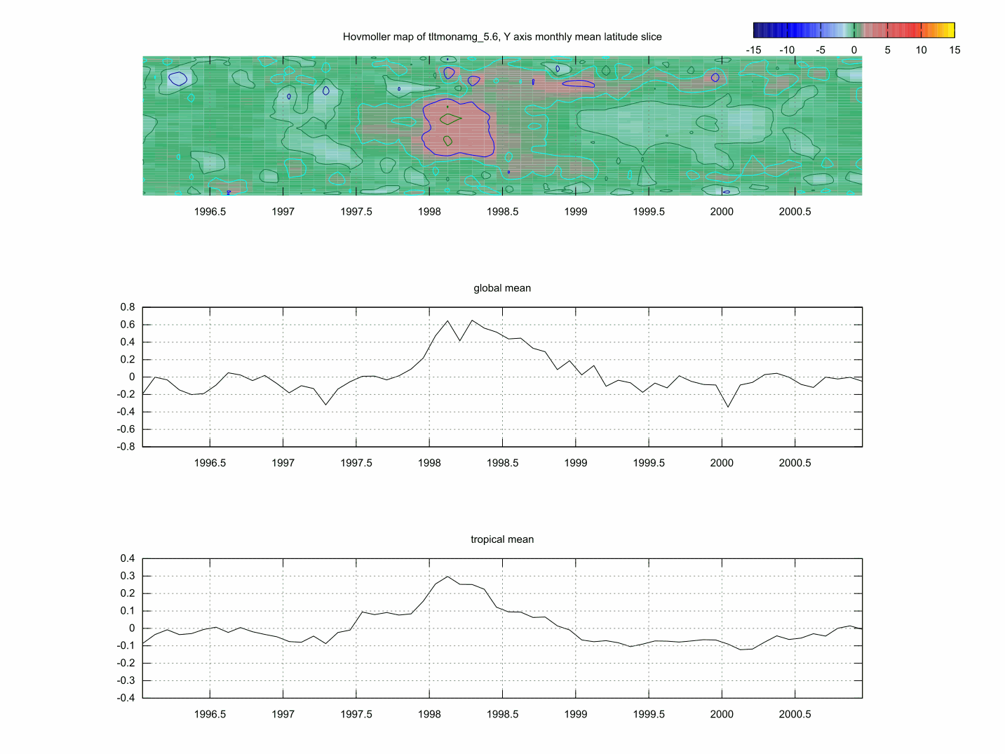
Figure 1, Hovmoller diagram of 1998 El Nino, UAH TLT V5.6 [1] (as PDF 142kB)
The 1998 El Niño event was similar to the less known ~1876 event, both seeming increasingly muted in the Met Office data. The El Niño form is a pulse of warmth primarily in tropical regions followed by a cool period. The warmth gradually disappearing apparently flowing poleward, producing a characteristic sideways V shape in Hovmoller graphics. The cool in inside the V. Perhaps preceeded by coolish. This pattern has repeated over the years.
Unfold
If instead of folding all longitudes into a mean as above a plain XY map for a month gives a different view, so we may be able to see from where on the globe there are contributions.
Global temperature map comparison

UAH TLT V6 beta, click for larger
This new work showcases one month available for all datasets, February 2015. The image above, lower troposphere from UAH V6 beta is merely a picture, the true work is in a PDF for local display. The intent is information, not hitting you in the face, so whilst as such green is a colour few people like that is how it has turned out. New geographic map, new colours.
Combined images, PDF (2.9MB), the cover page explains more.
I leave the reader to draw conclusions. As I get accused, understating, some surprises are inside.
A real world demonstration of cloud controlling radiation
The original text struck me as inappropriate so I’ve edited it. I put it down to being overtired. The original is archived if anyone wants to see it, just ask (there is a contact form), no questions asked on why.
This is a huge plot including hourly data from WMO3768 Farnborough, England, a synoptic Met Office station where I estimate the site meets WMO 2010 recommendation Class 1, although the presence of a triangular airfield runway layout surrounding the station will have some side effects.
A details view of the plot is only practical via PDF (201kB) Very likely the PDF will open looking as above so you need to set magnification and scroll around the plot, 100% is the intended view. Some details of interest are reproduced below at a normal scale.
Met Office, HadSST3, CRUTEM3, HadCRUT3, questions over gridded coverage
[update: I used an incorrect mix of datasets, see Talkshop thread here. Corrected PDF and now expanded to include HadCRUT4.
corrected PDF bundled in .zip (9.5MB) linked here HadCRUT3 and here HadCRUT4]
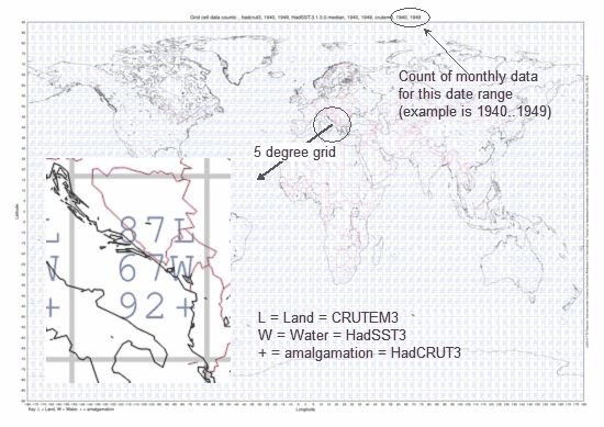
The UK Met Office / Hadley Centre (Met Office) / Climatic Research Unit (UEA) construct and publish global time series for temperature based on published 5 degree gridded. How this is derived from land meteorological station readings and ship board for sea surface temperature is unclear. The gridded to eg. global is a simple (cosine) weighted average which takes into account the variable area of a linear grid representing a sphere.
I have put together maps showing the data counts for decades over a world shore outline. These are provided as vector plots (master work), PDF, or for casual looks, PNG. The results are disturbing and particularly in the light of the Met Office producing 100 different versions of HadSST3. “Each of the following files is a zip archive containing ten realisations of the HadSST3 data set. There are 100 realisations in total.”
Do I detect obfuscation, flapping for distraction?
The poor state of HadSST
What follows is first art. I have yet to work out a better pictorial method. For now a tortured spreadsheet will do well enough.
You can just make out continental land masses…

Met Office HadSST3 (Hadley centre Sea Surface Temperature version 3) total cell data counts for monthly 2005..2014 on published linear 5 degree latitude/longitude grid. Should be 115 counts in all sea grid cells. Click image for full size version.
Data: Met Office HadSST3
I’ve known for a number of years of the dreadful state of climatic datasets, HadSST being one of those but did not have the pictorial evidence. Period from 2005 is an arbitary choice arising during software development.
When I first looked at the gridded SST data, some time before 2010 I noticed what seemed to be a mix of monthly and annual in cells, with many missing data. It also looked very dubious on coastline handling. This was noted but nothing further done.
August 2014 radiative cooling East Anglia, Northern Ireland, South Midlands
August 2014 there was a meteorological gift of both exceptional conditions and good data. What can be learnt?
Three Met Office sites showed a signature of exponential cooling. This requires clear sky and a calm. Given somewhat limited parameter hourly data the following shows the commonality. The computed terminal conditions are shown later in this article.

Benson and Santon Downham data has been normalised to Katesbridge[3], which has the least noisy data or the three.
Achieving a close overlay requires taking earth rotation into account, dusk and dawn move relatively both by geographic location and the peculiar movement throughout the year as night length changes, these do not move together [1]. Fractional delay (less that the sample period) was used to equalize diurnal time. (see the two blog articles here)
Dusk appears to be the important factor, a surprising finding, I assume cooling is time from dusk, dawn terminates cooling.
General information, under essentially calm conditions wind drops for a period during the night then reappears just after dawn. (not shown here)
Temperature normalisation defined is for the cold period, not as accurate for Benson where the better site exposure (more open) led to more wind at times.
Human warming of Great Lakes

Image NOAA, click for full size.
I came across the above graphic. On pondering I went huh?
The most eastern (right hand) is Lake Ontario. Is that a mistake, the only one largely ice free 2014, largely clear 1994.
Well…
More Luling
Following on from yesterday where Paul Homewood picked up on a comment I made on his blog see Luling Keeps Changing June 29, 2014, I took a look today at the NCDC data.
Maybe I picked up the wrong files, seems surreal.
I am now going to be precise step by step.
Part 1, Central England Temperature timeseries and Manley papers
This large article was composed some time ago, last edit Oct 2013 it seems but left unpublished, one of dozens.

There is a disturbing story behind the current CET dataset as will be revealed in Part 2. The above plot sets the scene, a straight illustration of the whole dataset with timeline.
This blog article is intended as a backgrounder covering a variety of information including links to official copies of the two historic Manley papers which are the basis of the CET dataset. In my opinion CET is misrepresented as more instrument based than it is in reality. More reasonably it is an expert opinion on weather.
The Met Office CET web page[1] mentions the whole data then plays pea and thimble silently showing a plot of the later subset. Reason to be revealed in part 2.
