Archive
Images of the 1998 El Niño in world temperature maps
A reader asked for a time representation… a tricky problem via a web site, the data is large…
Here are three different views, two from the UK Met Office and one from UAH, the newly released version. These run from January 1996 through December 2000.
Firstly here is an overview an Hovmoller plot for the same time span. These are widely used but rarely for earth whole views. Here are some I prepared earlier as a 2012 article (includes [2]) elsewhere which might help understanding on what I am doing for this article.
Figure 1, Hovmoller diagram of 1998 El Nino, UAH TLT V5.6 [1] (as PDF 142kB)
The 1998 El Niño event was similar to the less known ~1876 event, both seeming increasingly muted in the Met Office data. The El Niño form is a pulse of warmth primarily in tropical regions followed by a cool period. The warmth gradually disappearing apparently flowing poleward, producing a characteristic sideways V shape in Hovmoller graphics. The cool in inside the V. Perhaps preceeded by coolish. This pattern has repeated over the years.
Unfold
If instead of folding all longitudes into a mean as above a plain XY map for a month gives a different view, so we may be able to see from where on the globe there are contributions.
UAH global temperatures, version 5.4
Earlier today I wanted to take a quick look at the global plots.
Invoke update here which gets new data, nothing happens. I’d forgotten, or it had not registered with me there is a version change and that means filename changes. No problem.
My only comment is wondering about the amount of month to month variation, an ongoing gripe with this kind of dataset (all global datasets suffer): annual variation should not be present. Such variation has the chickens in panic, watching every doom twitch is going to break eggs.
[Commented added 29th. Had a quick look at V5.4 post 2002 and it looks improved, less annual variation. This problem is very tough for satellite data given a dataset from 1978 to date is a mix of disparate datasets. Only looking at post mid-2002 with UAH is single satellite, but as a whole dataset compromising one period for another is not an option, the dataset authors have a difficult job]
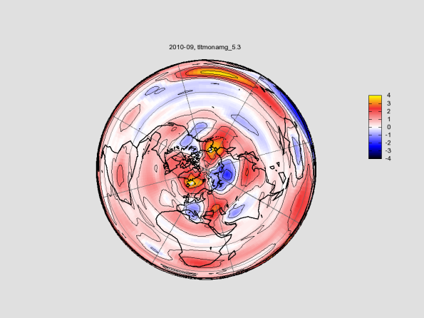
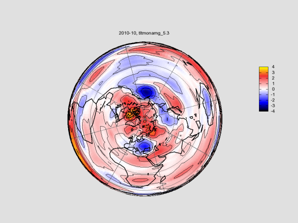
Here are September through December 2010 equal area plots, plus Hovmoller, 1990 through end 2010.
Click on an image for full size.
The pattern, can be seen over many years in Hadcrut3, is heat bumps in the tropics which then flows in time toward the poles, heat shedding. This is always followed by a colder time in the tropics. Pretty obviously this is in progress now. Expect much like the sequence after 1998. The recent cold in the northern temperature zone doesn’t figure, too transient and local to make the bigger picture.
I suspect a good measure of global is just a narrow band in the tropics, not global as such which adds confusion and time delays as heat flows. Those people trying to link terrestrial and solar might find it a better metric. That said, is there a variation in the degree of temperature variation in the north and of so why? Also the ongoing tilt from south to north, why? On the latter I suspect it is about to start moving back, but my reasons are unstated here.
Arctic UAH TLT polar temperature plots
Discussion on the Bishop’s blog could useful use plots of UAH lower troposphere data and since I can do this, two plots follow.
http://www.bishop-hill.net/blog/2010/11/27/the-arctic-gap.html
Both the following are rotated to roughly match the plots cited in the other blog.
Actually used, looks like 90,30 which is 30 degree clockwise, plot range +-4C, disc is for whole earth equal area:
lua query.lua uahtlt render year=2010 month=10 centre=90,30 size=1024,768 range=4 lamaz
This was all done quickly and I couldn’t remember how to do it! No doubt could be improved.
I am not looking for comments here.
Most accurate global temperature?
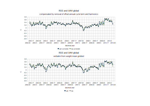
Further work on the satellite global monthly both RSS and UAH produces
This is the most accurate I can do at the moment.
A discovery was a time offset for the residual annual cycle and harmonics for both datasets, an unexpected and strange effect. Why? It ought to be centred on exactly one year.
I am nervous about allowing for this without knowing what is going on. Perhaps it is an artefact of the quantised satellite orbit mismatching orbital period. (is about 0.97 year instead of 1)
I’ve used datasets computed here from gridded because this avoids the Shannon limitation in the published data. (doubt it makes a material difference)
Data, intermediates, full explanations, ask.


