Archive
Images of the 1998 El Niño in world temperature maps
A reader asked for a time representation… a tricky problem via a web site, the data is large…
Here are three different views, two from the UK Met Office and one from UAH, the newly released version. These run from January 1996 through December 2000.
Firstly here is an overview an Hovmoller plot for the same time span. These are widely used but rarely for earth whole views. Here are some I prepared earlier as a 2012 article (includes [2]) elsewhere which might help understanding on what I am doing for this article.
Figure 1, Hovmoller diagram of 1998 El Nino, UAH TLT V5.6 [1] (as PDF 142kB)
The 1998 El Niño event was similar to the less known ~1876 event, both seeming increasingly muted in the Met Office data. The El Niño form is a pulse of warmth primarily in tropical regions followed by a cool period. The warmth gradually disappearing apparently flowing poleward, producing a characteristic sideways V shape in Hovmoller graphics. The cool in inside the V. Perhaps preceeded by coolish. This pattern has repeated over the years.
Unfold
If instead of folding all longitudes into a mean as above a plain XY map for a month gives a different view, so we may be able to see from where on the globe there are contributions.
Global temperature map comparison
This new work showcases one month available for all datasets, February 2015. The image above, lower troposphere from UAH V6 beta is merely a picture, the true work is in a PDF for local display. The intent is information, not hitting you in the face, so whilst as such green is a colour few people like that is how it has turned out. New geographic map, new colours.
Combined images, PDF (2.9MB), the cover page explains more.
I leave the reader to draw conclusions. As I get accused, understating, some surprises are inside.
The poor state of HadSST
What follows is first art. I have yet to work out a better pictorial method. For now a tortured spreadsheet will do well enough.
You can just make out continental land masses…

Met Office HadSST3 (Hadley centre Sea Surface Temperature version 3) total cell data counts for monthly 2005..2014 on published linear 5 degree latitude/longitude grid. Should be 115 counts in all sea grid cells. Click image for full size version.
Data: Met Office HadSST3
I’ve known for a number of years of the dreadful state of climatic datasets, HadSST being one of those but did not have the pictorial evidence. Period from 2005 is an arbitary choice arising during software development.
When I first looked at the gridded SST data, some time before 2010 I noticed what seemed to be a mix of monthly and annual in cells, with many missing data. It also looked very dubious on coastline handling. This was noted but nothing further done.
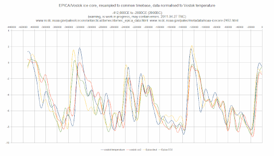
Ice core CO2 and temperature, lead or lag, ongoing saga
Argument over whether the two long ice cores, EPICA and Vostok are evidence of CO2 leading or lagging temperature has been going on ever since the core data was published. I assume the reader knows this.
A snippet has turned up as a result of an article at Bishop Hill.
Republished images as an aide memoir for the subject
Plots, own work. Pertinence, read on.
The Bishop Hill article is from an anonymous teacher of statistics where a cross-disipline dispute arose.
Even NASA have trouble prising raw data out of friend researchers

Image couresty NASA, discovery of a new class of star
This is a tale where I am going to maintain cloaking embarressment over wasting the time of others.
The original version of this story, which I have read, is not as kind, Rather annoyed folks were writing.
In many cases raw data is not available or only pseudo raw, ie. cooked in various unspecified or even unknown ways, when raw means what it says, original instrumentation data, with ancillary full information. Too often claims of raw are plain nonsense. This has wasted my time, prevented proper data processing, etc. a lot of tales I could recount.

